Accessibility in Motion:
Redesigning the Thule Mobile App
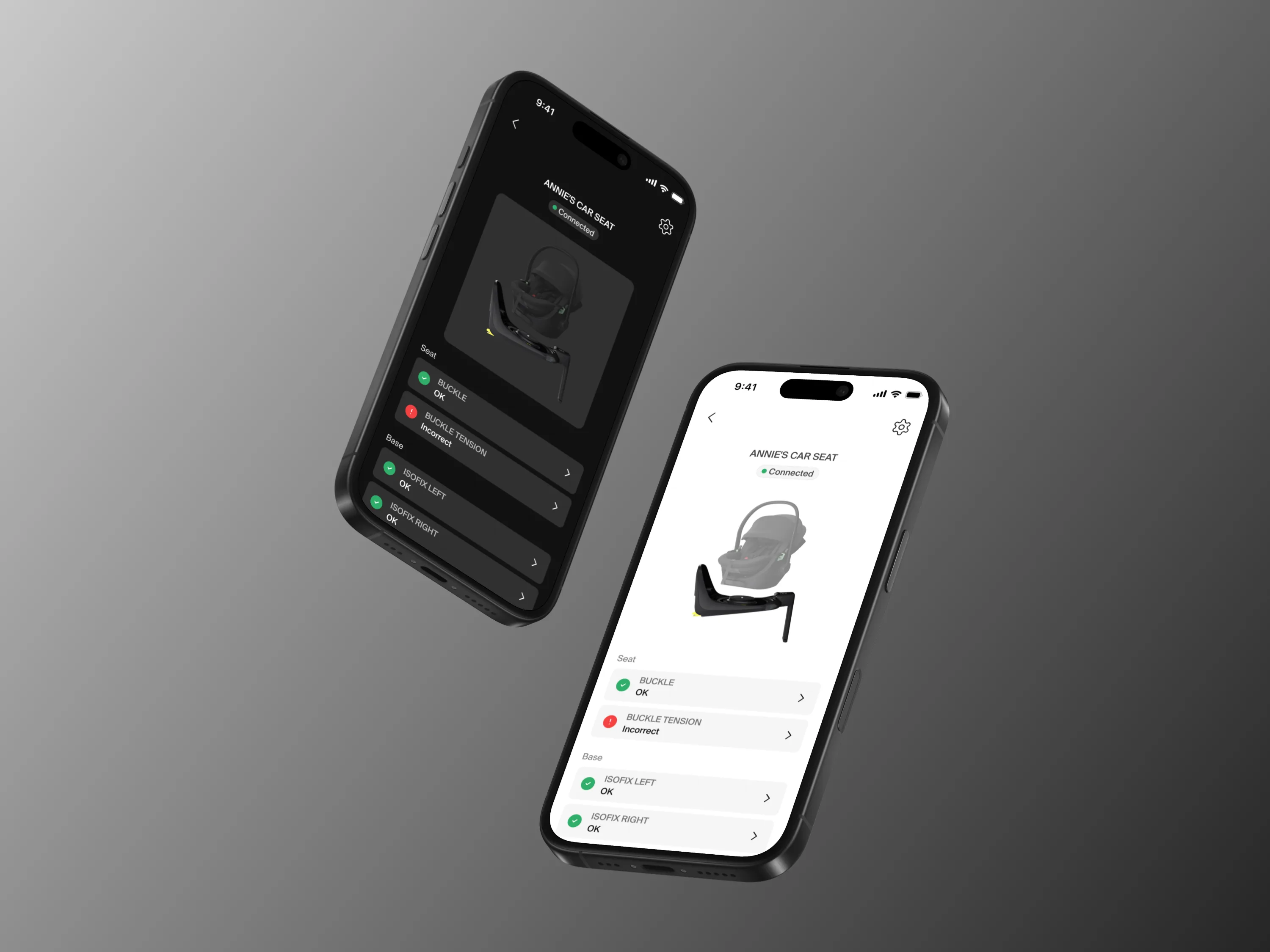
Company: Thule Sweden AB
Role: UI/UX Designer
Timeline: January - June 2026
Location: Hillerstorp, Sweden
This project was conducted in collaboration with Thule Sweden AB to investigate the limitations of
current
accessibility guidelines such as WCAG 2.2 when applied to dynamic environments. The final
deliverable
included 14 context-specific accessibility recommendations and a high-fidelity redesign of the Thule
Mobile App .
.
By reducing interaction friction for users on the go, this redesign directly enhances product safety, increases user adoption in high-stress scenarios, and solidifies long-term brand trust.
The Problem
Mobile applications are frequently used in dynamic environments, yet existing accessibility frameworks like WCAG 2.2 primarily address static use cases. This overlooks Situationally Induced Impairments and Disabilities (SIIDs).
SIIDs are temporary conditions caused by environmental factors, such as bright sunlight mimicking low vision or physical multitasking mimicking motor impairments. When users interact with the Thule app while pushing a stroller or managing physical hardware, a lack of situational accessibility becomes a significant usability and safety issue.
Research & Discovery
- WCAG 2.2 Audit: Evaluated the existing application against standard guidelines, finding technical gaps in complex gestures and programmatic labelling.
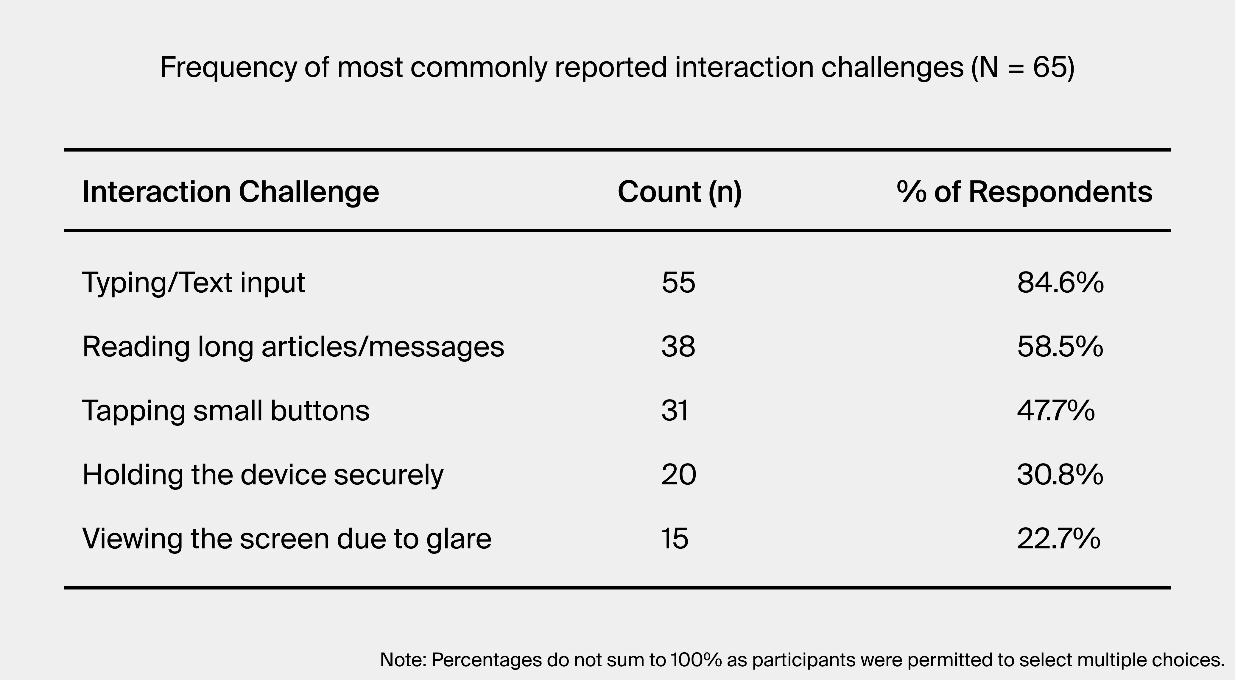
- General Survey: Data from 65 participants regarding mobile use in dynamic environments revealed that 47.7% of users struggle with tapping small buttons, and 22.7% experience severe screen glare.
- Contextual Inquiry: Observing users pushing strollers in Slottsskogen park exposed the physical compromises users make, such as limited dexterity when steering a heavy stroller with one hand.
- Targeted Survey: Feedback from 16 Thule pilot testers highlighted poor adaptability when phones were mounted to car cradles.
Synthesis & Navigating Trade-offs
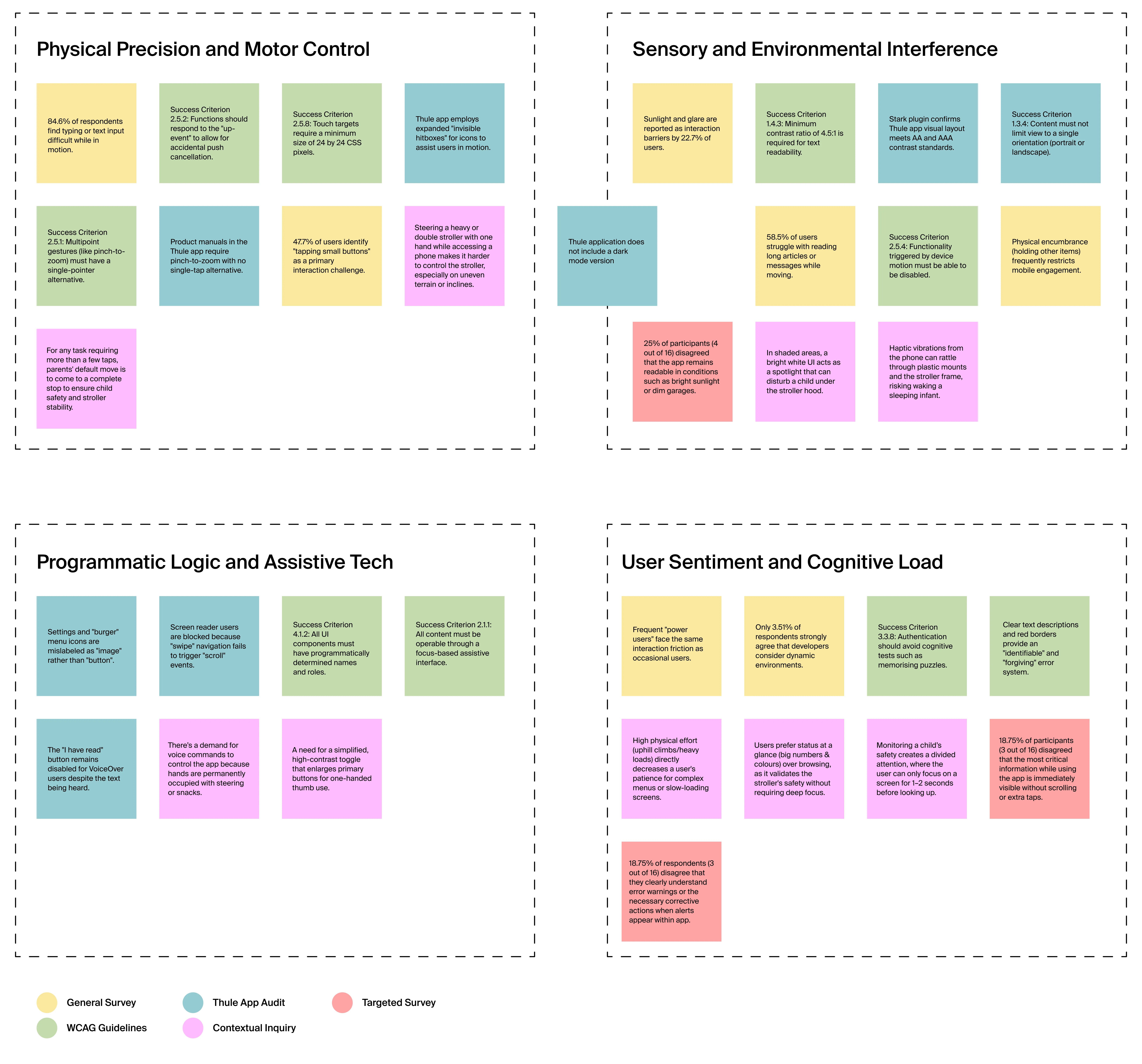
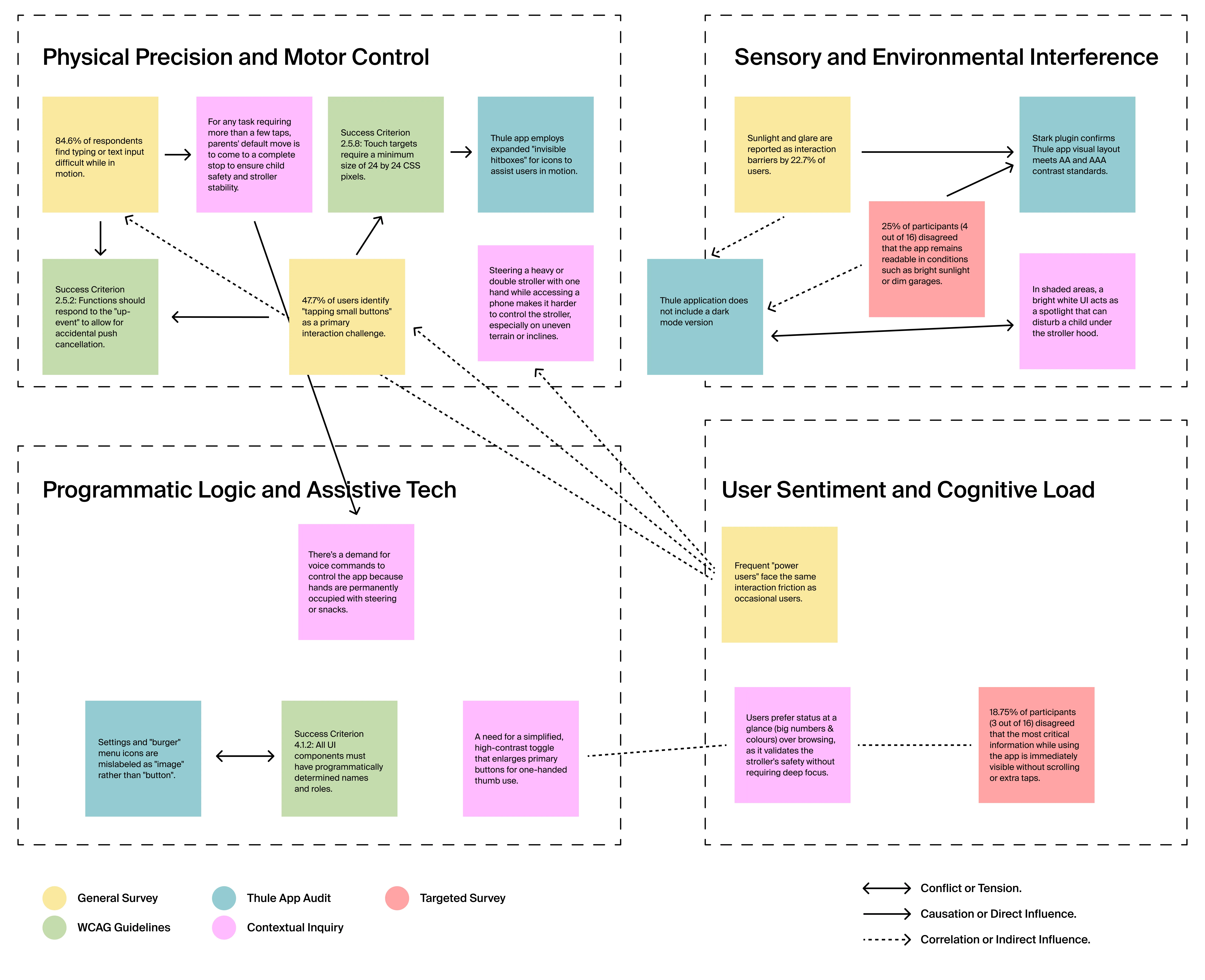
Using the KJ Method, we mapped the relationships between our research data to identify core friction points. We found that physical precision, sensory interference, and cognitive load compound one another in active scenarios. Designing for these extremes required balancing aggressive accessibility needs with established brand conventions.
The Solution & Key Features
The final high-fidelity prototype introduced several critical features to support dynamic use, prioritizing functional minimalism and high error tolerance. These designs have been evaluated with users, employing the RITE method
Dark Mode Theme: Implemented a system-wide dark mode. This reduces eye strain in low-light environments and gives users the options to customize their experience.
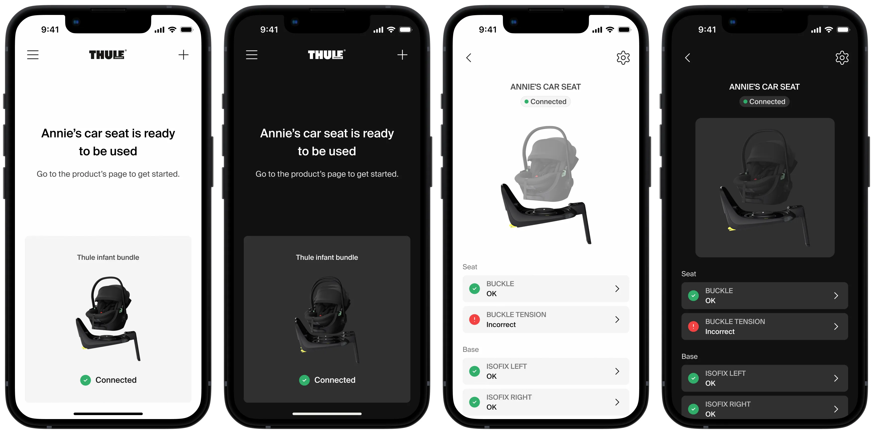
Thumb-Zone Ergonomics: Moved primary Call-to-Action buttons to the bottom quadrant of the screen to enable safe, one-handed operation.

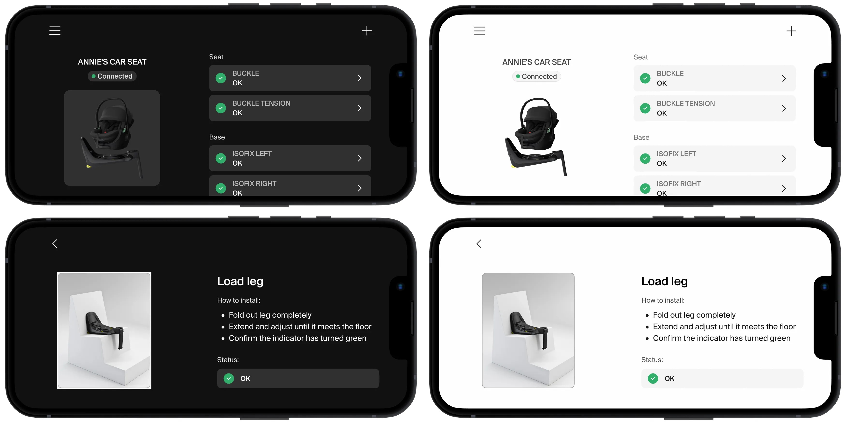
Orientation Flexibility: Designed dedicated landscape layouts to support users who place their phones in fixed mounts on strollers or car cradles.
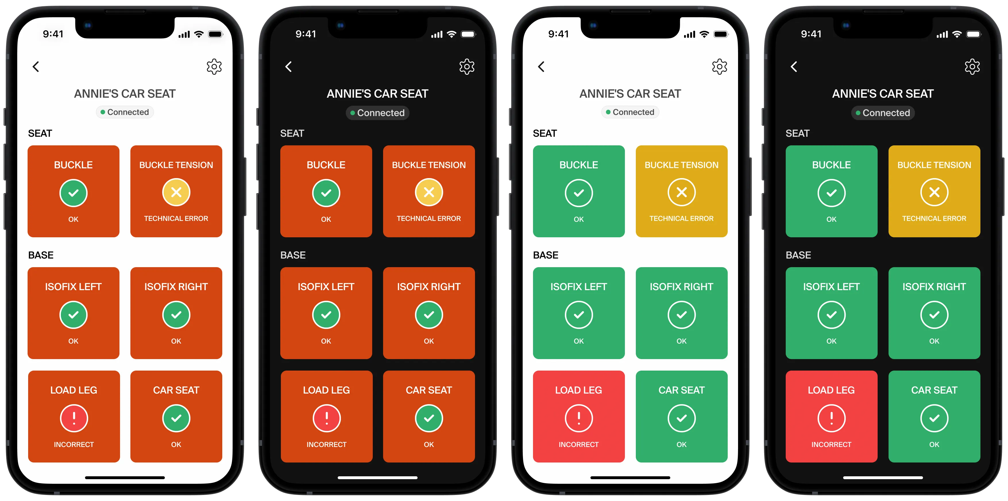
Active Mode: Designed an optional interface toggle that prioritizes function over form. It removes non-essential product images, increases text size, and condenses all controls into a single, non-scrolling screen to reduce cognitive load.
Outcomes
The research culminated in 14 context-specific recommendations that bridge the gap between static
WCAG compliance and real-world mobile usability. By demonstrating how functional minimalism and
ergonomic adaptability supersede traditional aesthetics in high-motion environments, the project
provides a scalable framework for inclusive digital ecosystems. For a comprehensive breakdown of the
methodology and findings, read the full research paper.